What are Content Layouts?
Content Layouts Overview
Content layouts are the sections between the header and the footer that make up a web page. They are part of the body content of a website and are typically page-specific (whereas the header and footer are persistent across the entire website).
The Structure of a SiteDrawer Webpage
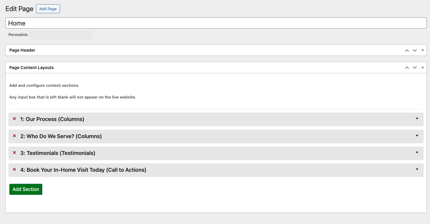
SiteDrawer webpages are structured using content layouts. Each layout is considered a section and is populated with a specific layout (or content type) that best represents the content for that section.
Professionally Designed Content Layouts
Each section of the webpage can be populated with any of the available content layouts. Once the layout type is selected, you can choose from the available styles to best suit the type of vibe you want for your website.
Each layout is professionally designed so that:
- It looks great on all screen sizes
- It fits with the rest of your website (colours, fonts etc.)
- Is well optimized for ease of use and loading times
- Can easily reference other website content or Modules
List of Content Layouts
| Content Layout | Description | Example |
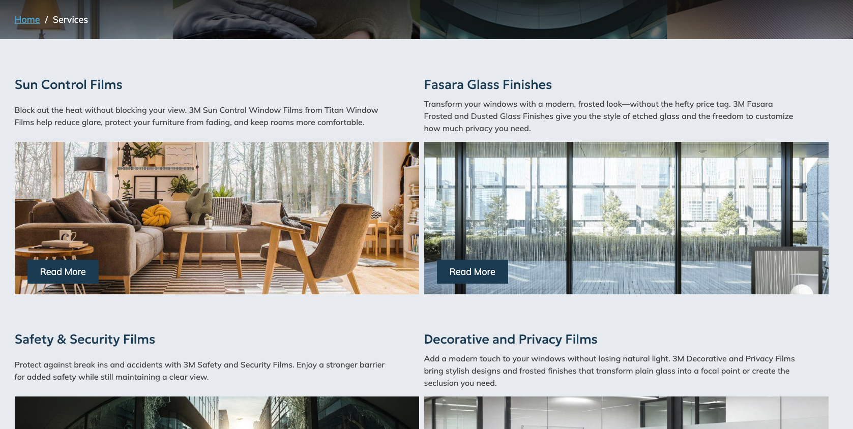
Standard Content Section |
A commonly used layout that consists of a heading, text, image and call to action. |  |
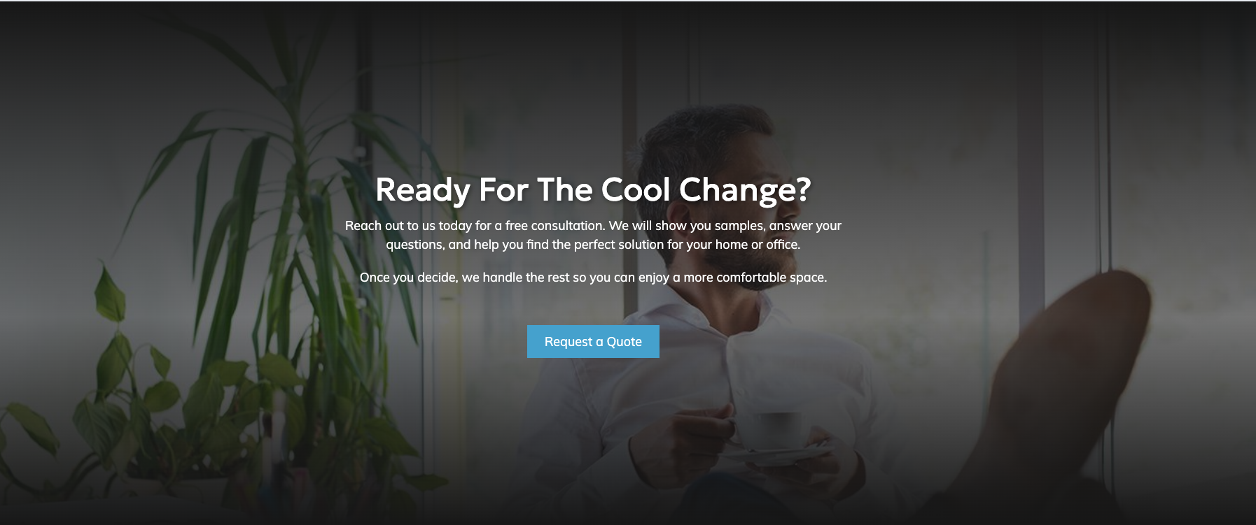
Call to Action Section |
A section that encourages the user to take a specific action. Generally placed toward. the bottom of the page, it can be a banner or a full-sized section. |
|
Child Page List Section |
Used to list all of the child pages of the current parent page. This is good for index pages. To learn more about parent and child pages, visit our Glossary. |
|
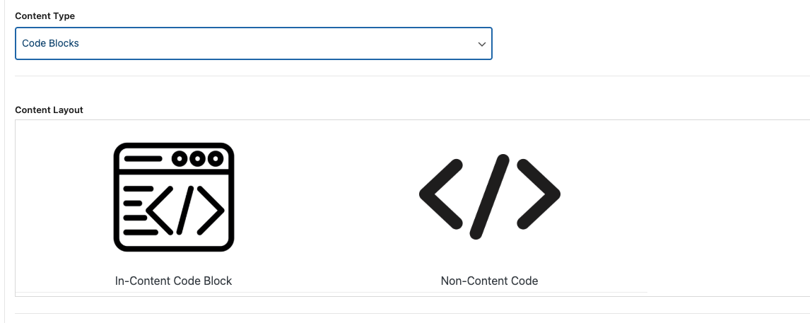
Code Block Section |
Use to add custom code to the webpage. The code block can be:
|
|
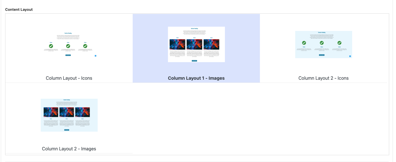
Column Section |
Used to display content in a column format. This content type is great for repeated items like benefits, features, and key details. Links to the Columns module to easily make column content repeatable across many pages of your website. |
|
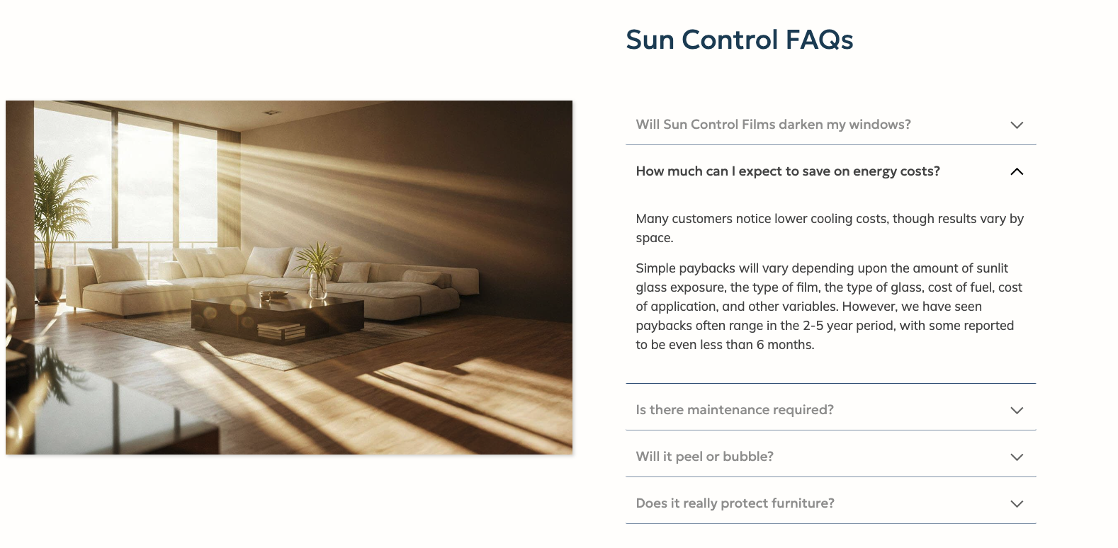
FAQ Section |
Used to display information an accordion style format (collapsible containers). Most commonly used for FAQs but can be used for any type of content.
Links to the FAQs module. |
|
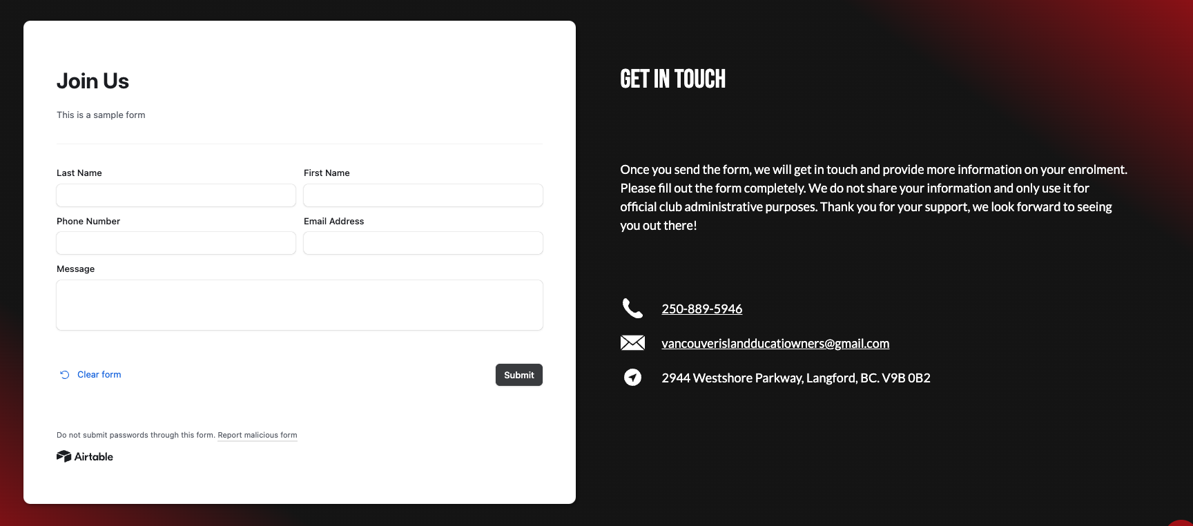
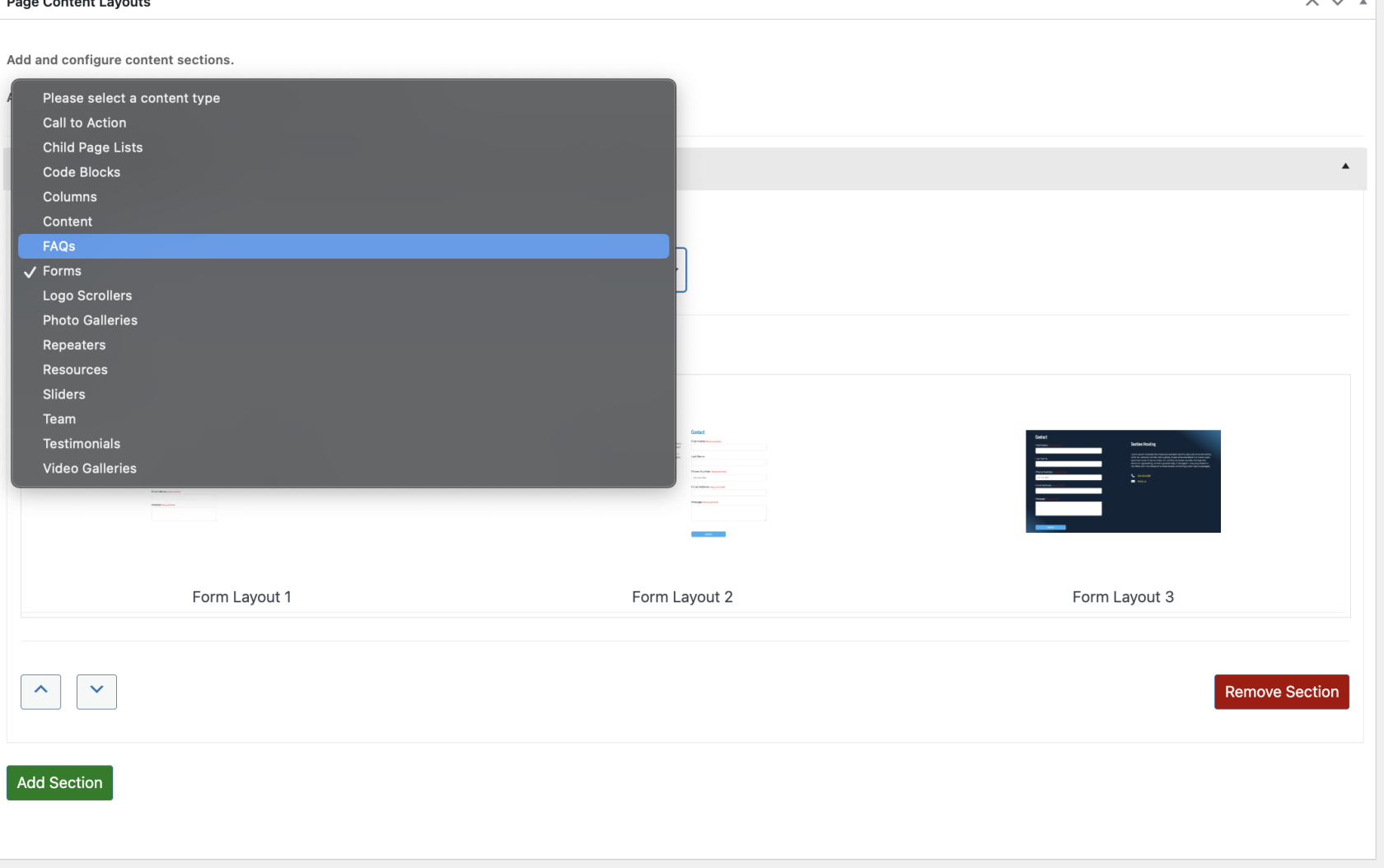
Form Section |
Used to display contact information and a linked form from the Forms module.
Forms can be internally created or linked from an external service (like AirTable of Google Forms). |
|
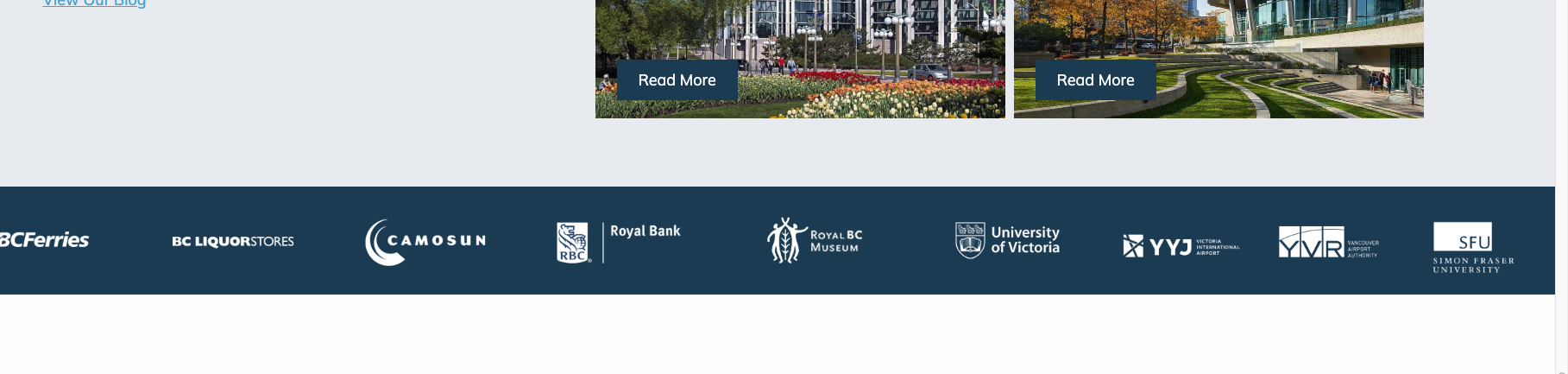
Logo Scroller/Banner Section |
Used to display a scrolling or static list of logos. Commonly used in client or partner lists.
Connects to the Logo Scroller/Banners module |
|
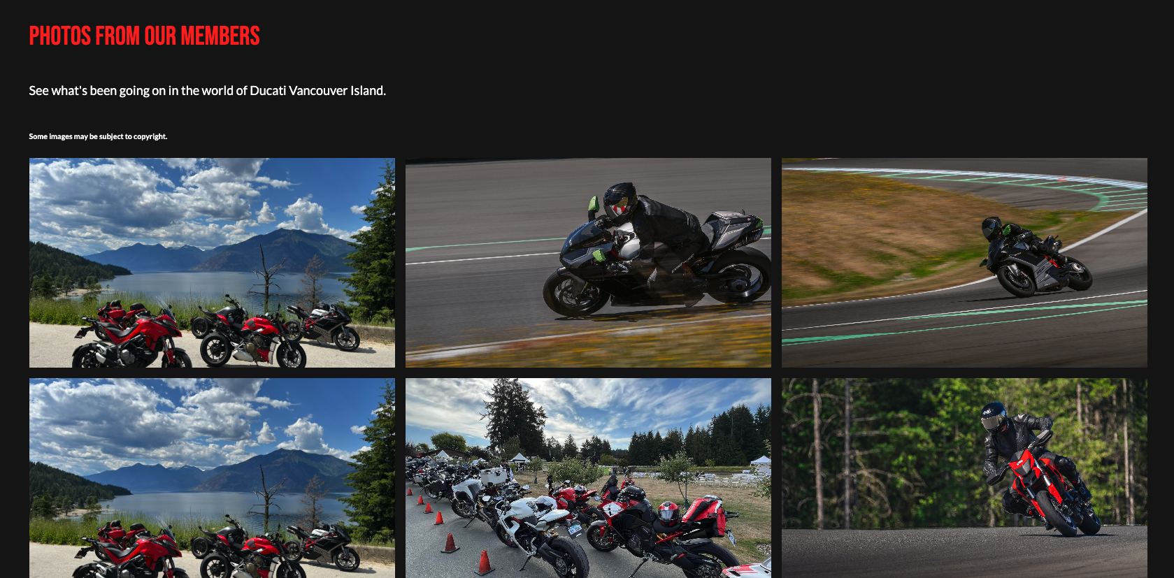
Photo Gallery Section |
Used to display a photo gallery in a grid/masonry format with a built in photo carousel for enlarged viewing.
Connects to the Photo Galleries module. |
|
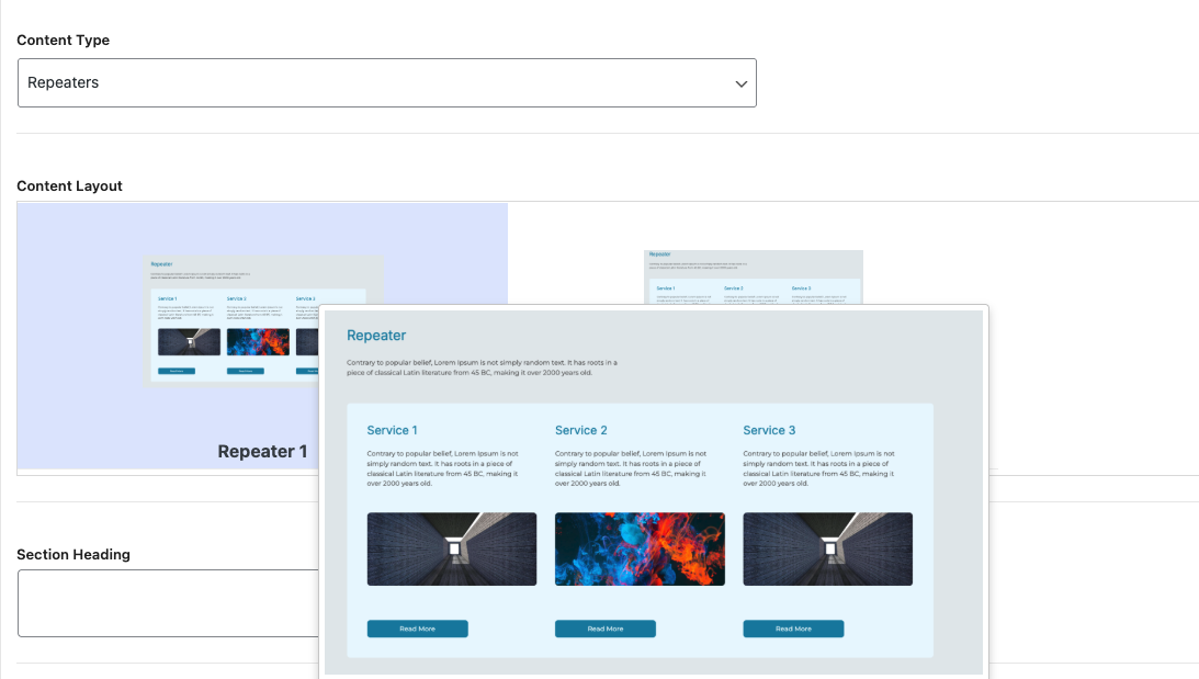
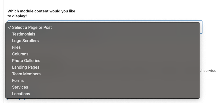
Repeater Section (Beta) |
Used to display content from another module in a repurposed way.
This might be useful for an index where you'd like to direct the user to a variety of possible pages. |
|
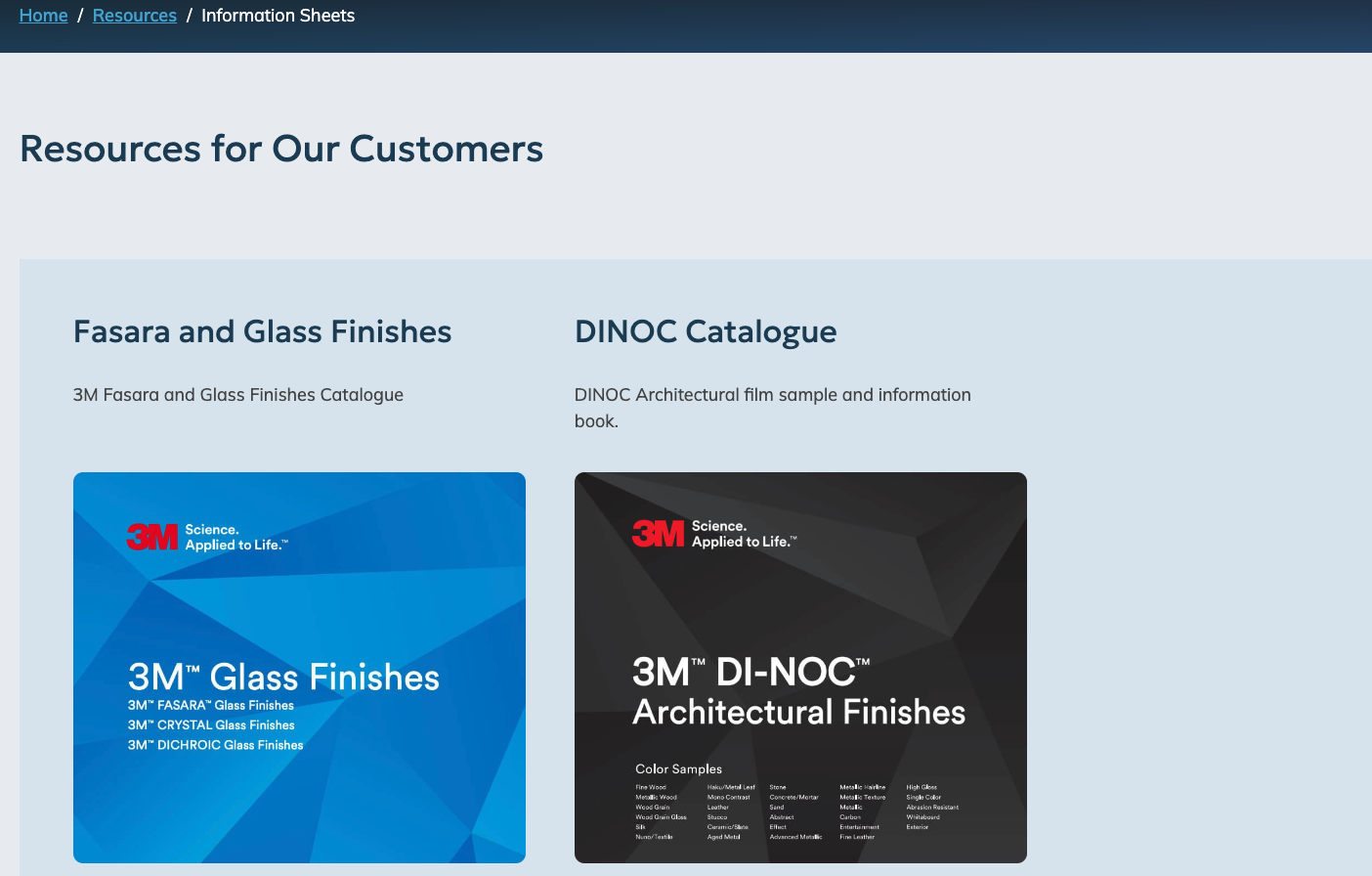
Resources Section (Beta) |
Similar to Repeaters, this section is used to display an index of the content on your website.
For example, you might have a list of information PDF sheets on your website, each with a link to the PDF.
The Resources section would list all of the projects, allowing the user to click through to visit the detail page. |
|
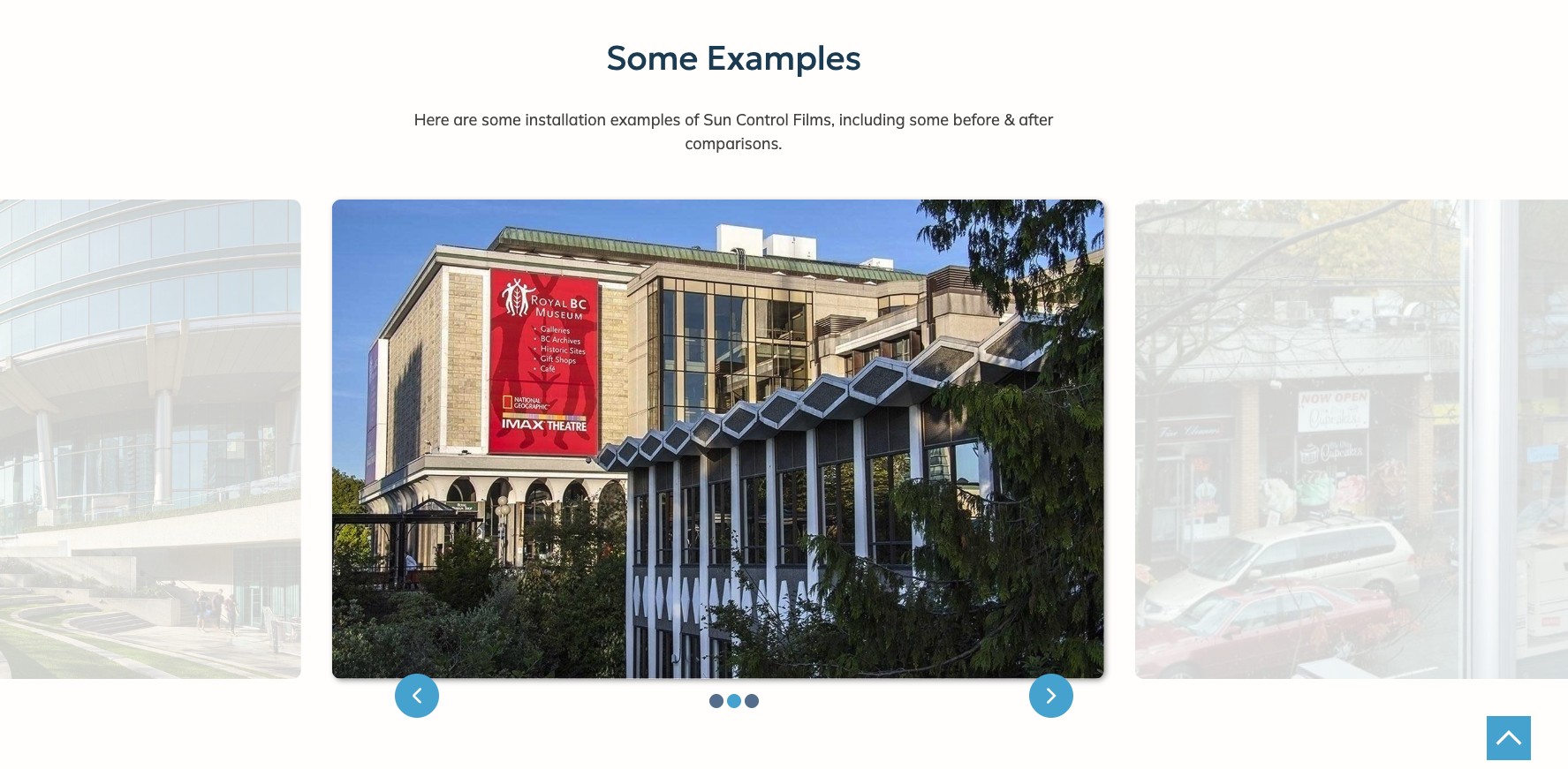
Slider Section |
Instead of a photo gallery. you can enable an animated slider for this section.
This links to the Photo Galleries module. |
|
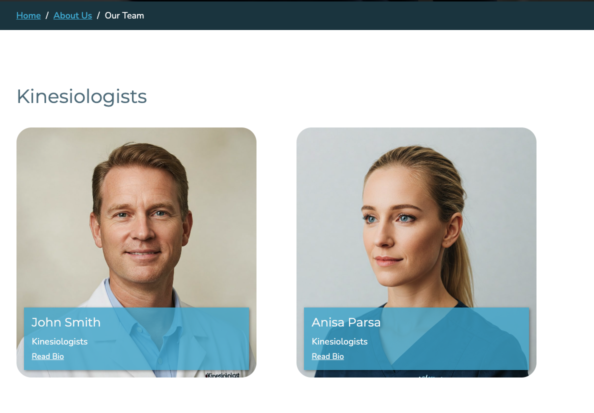
Team/Staff Section |
Used to display an index of your team/staff members from the Team/Staff module.
Depending on the layout, the team members can be grouped by position and/or designation, or just displayed in a sorted list. |
|
Testimonial Section |
Displays linked testimonials from the Testimonials module in a variety of formats. |
|
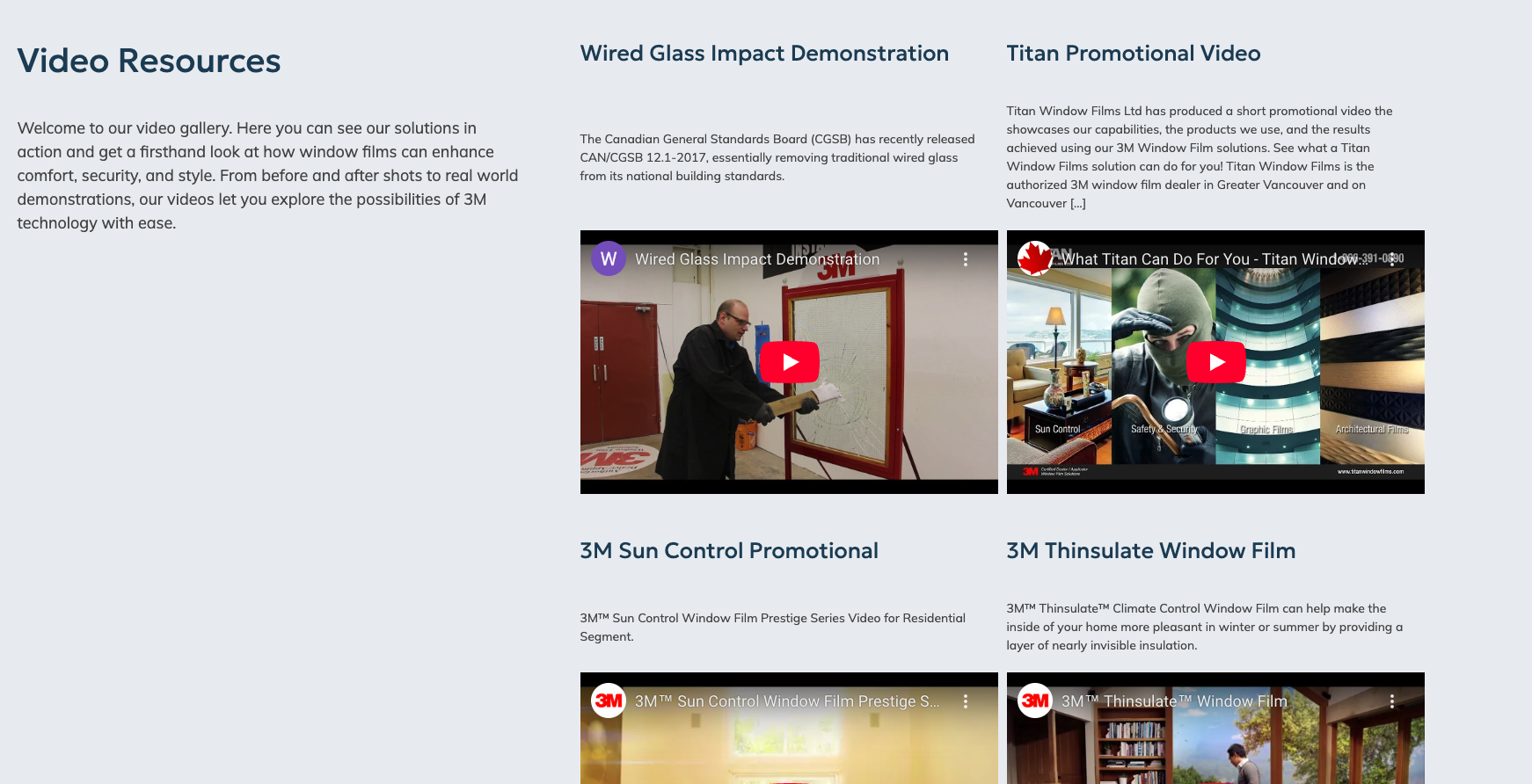
|
Displays a video gallery of the videos added to the Content area of your website and designated as videos. |
|
| ||
| ||
|